- by Rachel Vidal
- Jul 18, 2025
- splash page
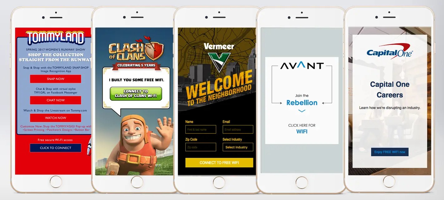
Providing free WiFi access to the attendees who visit your booth at an event might seem like the only thing your captive portal can do, but many businesses also use their splash pages to achieve some major brand engagement goals.
How?
From the time event attendees land on your WiFi captive portal or splash page until they click through to the rest of the Internet, their attention is directed at the contents of your page. Now it’s up to you to make good use of their undivided attention and generate engagement. Some common practices include showcasing the following elements on your page:
- Basic information about your company
- Contests that require sharing attendee data
- Ads from partners
- Internet-use disclaimers
For yet more engagement, you can also share exclusive event-only pictures, videos, coupons, merchandise, and downloadable apps.
But why exactly should you do this?
- It’s an opportunity to start a conversation.
Splash pages are a great way to showcase your business and collect attendee contact information for future communication. You might also appeal to your WiFi users for a quick like or follow, or prompt them to share event pictures and reviews as well as inviting them to sign up for your newsletters, alerts, etc.
- It offers a higher level of control and security.
An Internet-use disclaimer on your splash page ensures that your WiFi users accept your terms of service. This enables you to utilize bandwidth restrictions and data caps on a per-user basis and gives you a higher level of control and security.
The end result? Increased brand awareness, better user engagement, improved customer loyalty, valuable data captured for future marketing, and the opportunity to upsell new products and services to a huge number of event attendees.
Now that you’re convinced of the benefits of customizing your WiFi captive portal, the next step is learning how to make the most of your page. Here are some splash page best practices that you should follow for maximum effectiveness:
Avoid having too much content.
While your splash page can be used in a number of ways to generate engagement, using all of them at once is a big mistake. It’s smarter to restrict the number of elements on your page in order to keep it from becoming too convoluted or having too much information. Focus on the essential items while ensuring an intuitive UI and easy log-in.
For example, you might include your logo, some welcome text, and a few different login methods. If you need users to accept your terms and conditions, ask your legal consultant to reduce the amount of text in the splash-page disclaimer to a minimum and add a link to the full terms and conditions at the end.
Use fewer colors for a more straightforward visual experience.
Rather than using five bright colors on your splash page, try using two. Fewer colors promote a longer attention span and better readability, encouraging more people to sign in to your WiFi.
Try using monochromatic backgrounds or simple images with just a few items and a uniform color set. And if you have various login methods, consider reducing the amount of space each button takes up (while still leaving them large enough for mobile users to press) as this will make the page look less cluttered.
Focus user attention on key elements.
To make your splash page more intuitive, try to focus users on the most important elements with the following methods:
- Make your headers bold – Want to direct user attention to specific parts of your page? Make the titles bold. This differentiates them from unformatted text and ensures immediate attention.
- Put some space between elements – To distinguish between the various elements on your splash page, make use of spacing and interlining. You can also use white space to focus user attention on single elements, such as your logo, important text, or buttons.
- Use images with a clear meaning – Don’t just use images as artistic elements; rather, choose images that reflect your brand and the message you want to send. Or use them to drive emotions, such as a sunset or a smiling face.
Make your WiFi login page accessible.
None of the above tips will work if your splash page doesn’t guarantee an easy log-in process. Your attendees are on your page for one purpose: WiFi access. Having a user-friendly log-in experience will go a long way in preventing them from seeking another network out of frustration. Here are some tips for better captive portal accessibility:
- Make the text readable – Use an appropriately large font size, at least 20pt. Don’t use a complex font that’s difficult to read on the go.
- Create some contrast – Use clear colors so that your text always stands out from the background. Also try to create contrast by keeping the page clean, with sufficient breathing space between the text and other elements and by not using colored rectangles behind the text.
- Use large, accessible buttons – Make your splash page experience better for mobile device users by having larger buttons, preferably positioned at the bottom so that reaching and clicking them on mobile devices is easier.
- Offer a way out – If you use a social login method for WiFi access, be sure to offer an alternative method of authentication (e.g., via email) as well. Not everyone has a social account or is willing to share their credentials; some might prefer to use their email account instead.
Creating an effective splash page isn’t difficult. Just keep these tips in mind, and you’ll be on your way to achieving effective, compelling brand exposure in no time.
Trade Show Internet offers flexible WiFi Captive Portal and splash page solutions for all types of events. For more information, drop us a line, and our team will be in touch.
Trade Show Internet is the leading independent Internet Service Provider in the events industry.
- Phone: (866) 385-1504
- Email: support@tradeshowinternet.com
Event Types
Customer Events
About Us
2026 © Trade Show Internet